
Yellow is a cheerful and warm shade that is well suited for the interior of the kitchen. Adding yellow will help create a cozy atmosphere and turn the kitchen into the real heart of your home. How to use yellow in the kitchen correctly, which shades to choose and how to successfully combine it with other colors.
Why yellow is a good choice for the kitchen
Yellow is a great color to use in the kitchen, because it adds warmth and brightness to the space. In addition, yellow is said to stimulate the appetite, stimulating the desire to eat. Therefore, it is an ideal shade for a room where food is prepared and eaten.
Yellow, like all shades, can look different depending on the lighting, so choose the right tone for your kitchen.
How to add yellow to the design of the kitchen
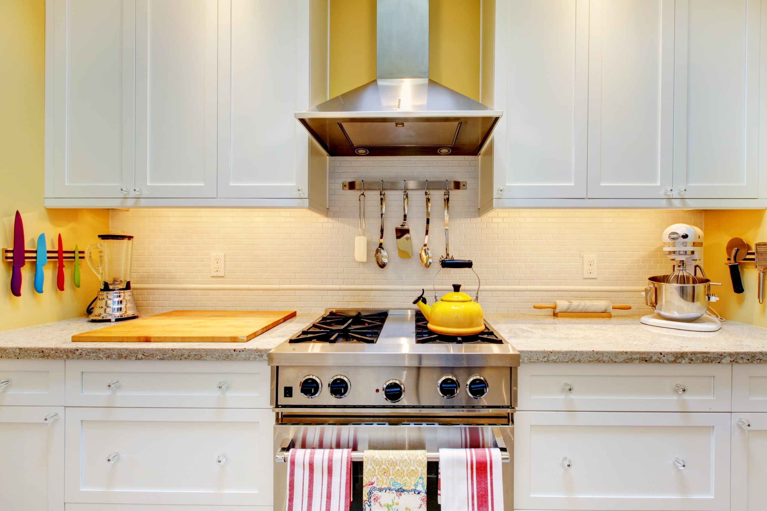
Yellow walls. If your kitchen lacks natural light, yellow is a great option for the walls. For a light and fresh look, combine a sunny shade with white cabinets. At the same time, mustard yellow is a great choice for an accent wall, which will make the interior more cozy.
Yellow furniture. Add yellow in the form of furniture – a cabinet, a kitchen island or open shelves. Bright sunflower color looks good with white walls, while mustard goes well with wooden surfaces, adding Scandinavian charm.
Yellow accessories. If you are not ready for an all-yellow kitchen, use yellow accents: an apron, chairs or lamps – they will enliven the interior without much effort.
Successful combinations of yellow with other colors
Yellow and blue
Sunflower and navy blue. Sunflower yellow adds warmth and brightness, while navy blue creates depth and contrast. This combination adds dynamism and modern style.
Lemon and turquoise. Lemon yellow emphasizes freshness, and turquoise adds a marine accent, creating a light, bright and modern kitchen.
Yellow and green
Mustard and pistachio. Warm mustard yellow harmoniously combines with soft pistachio green, creating a cozy, natural interior in the Scandinavian style.
Pastel yellow and olive. Pastel yellow gives lightness, and olive adds softness and organicity. This is a great option for country or eco-style interiors.
Yellow and gray
Light yellow and ash gray. Light, almost pastel yellow adds warmth, and ash gray calms the space, creating a soft, elegant interior.
Mustard and graphite gray. The contrast between rich mustard and deep graphite creates a stylish and modern look, which is especially suitable for loft-style kitchens.
Yellow and red
Lemon and terracotta. Lemon yellow and rich terracotta red create an energetic and cheerful interior, which is perfect for a Mediterranean-style kitchen.
Pale yellow and coral. A soft and warm combination to create a cozy space that adds tenderness and warmth.
Yellow and white
Butter yellow and ice white. Butter yellow adds warmth, and ice white refreshes the interior. This combination creates a clean and bright space.
Lemon and creamy white. Lemon adds brightness, and creamy white makes the space delicate and soft. Perfect for classic or modern kitchens.
Practical tips for using yellow in the kitchen
In the yellow palette, you can find shades that are suitable for any style of kitchen.
The main groups of shades of yellow can be distinguished:
Bright shades: lemon, egg yolk, curry and the like. It is advisable to use these colors as accent colors and in small quantities.
Moderate shades: mustard, sand, straw, sunny and the like. These are soothing shades, and even in large quantities they will not cause irritation.
Light shades: champagne, custard shade, pastel yellow and the like are suitable for a kitchen in any style, from classic to traditional and from modern to minimalist. If your kitchen is small, it is better to use lighter shades – they will visually increase the space.
Yellow goes well with natural materials. Wooden countertops or flooring will emphasize the natural warmth of yellow, and metal elements will add modernity.
But for all its advantages, yellow is one of the most dangerous colors in the spectrum. This is because a large number of too bright tones can be annoying. Therefore, it is important to use it in the right proportions, combinations and shades.